Ania Kruk
e‑commerce
redesign
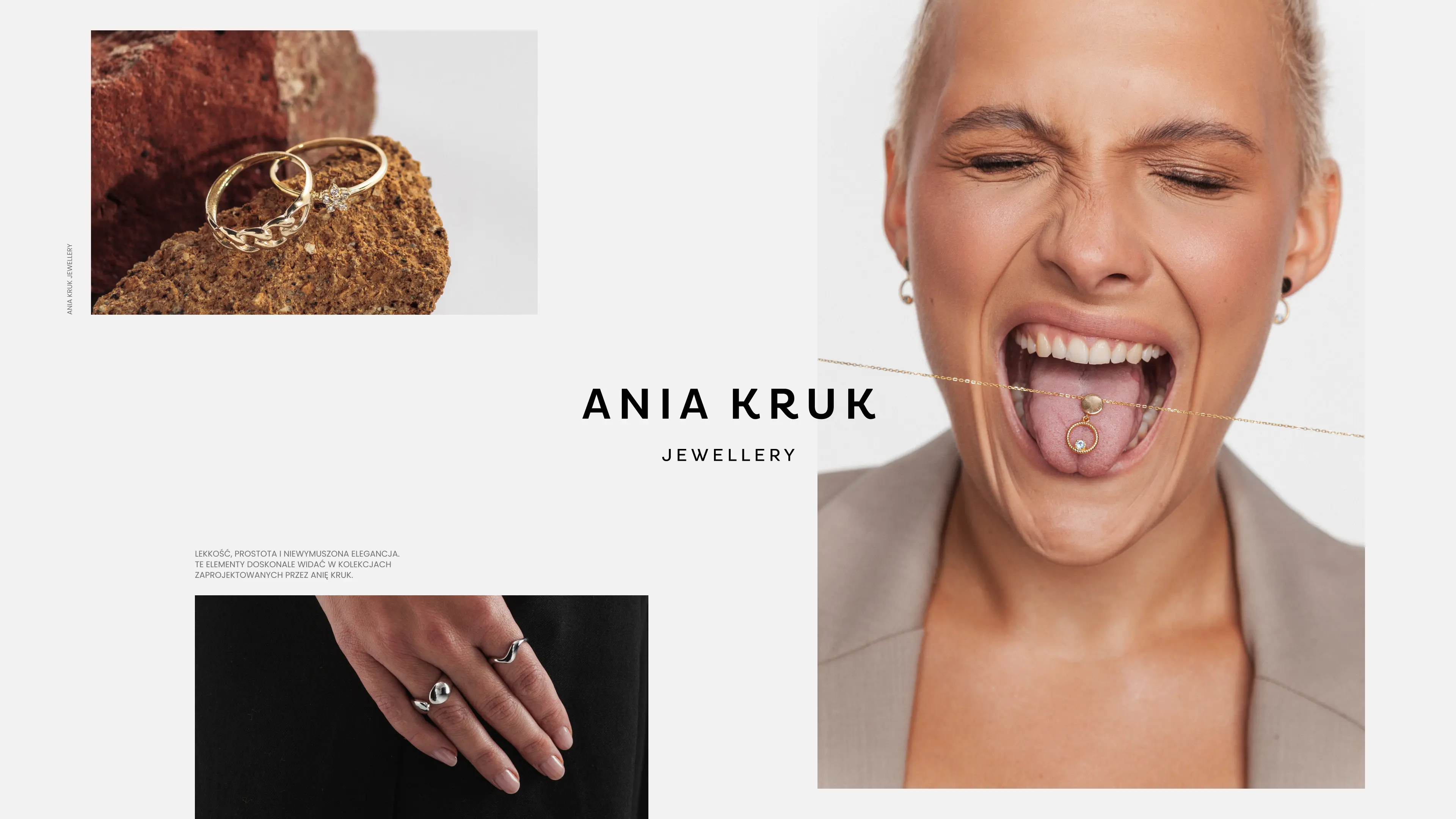
Ania Kruk, a well-known Polish jewelry brand enjoying rapid sales growth, faced significant technological and usability challenges. Its outdated e-commerce platform hindered further growth, generated high maintenance costs, and struggled to meet rising customer expectations.
The project's goal was a complete redesign of the online store: a better shopping experience, easier content management, and a look that matches the brand.
My role: UX Design, UI Design
Client: Ania Kruk
Agency: Move Closer
Team: Wojtek Wawrzyniak, UX Design
Date: 2023
Key Challenges
Ania Kruk was selling well, but the platform was holding the brand back. The outdated technology made content management and updates difficult. The user experience didn't support the sales potential. And the design no longer matched the image of a modern, trend-aware jewelry brand.
Discovery
We started with a UX audit of the existing site, which revealed the key usability problems. In-depth interviews with the Ania Kruk team during discovery workshops helped define business priorities and expectations for the new platform. In parallel, we analyzed competitors in e-commerce, particularly jewelry and fashion. All of this became a set of detailed user stories: the foundation for solutions that address real user needs.
Design
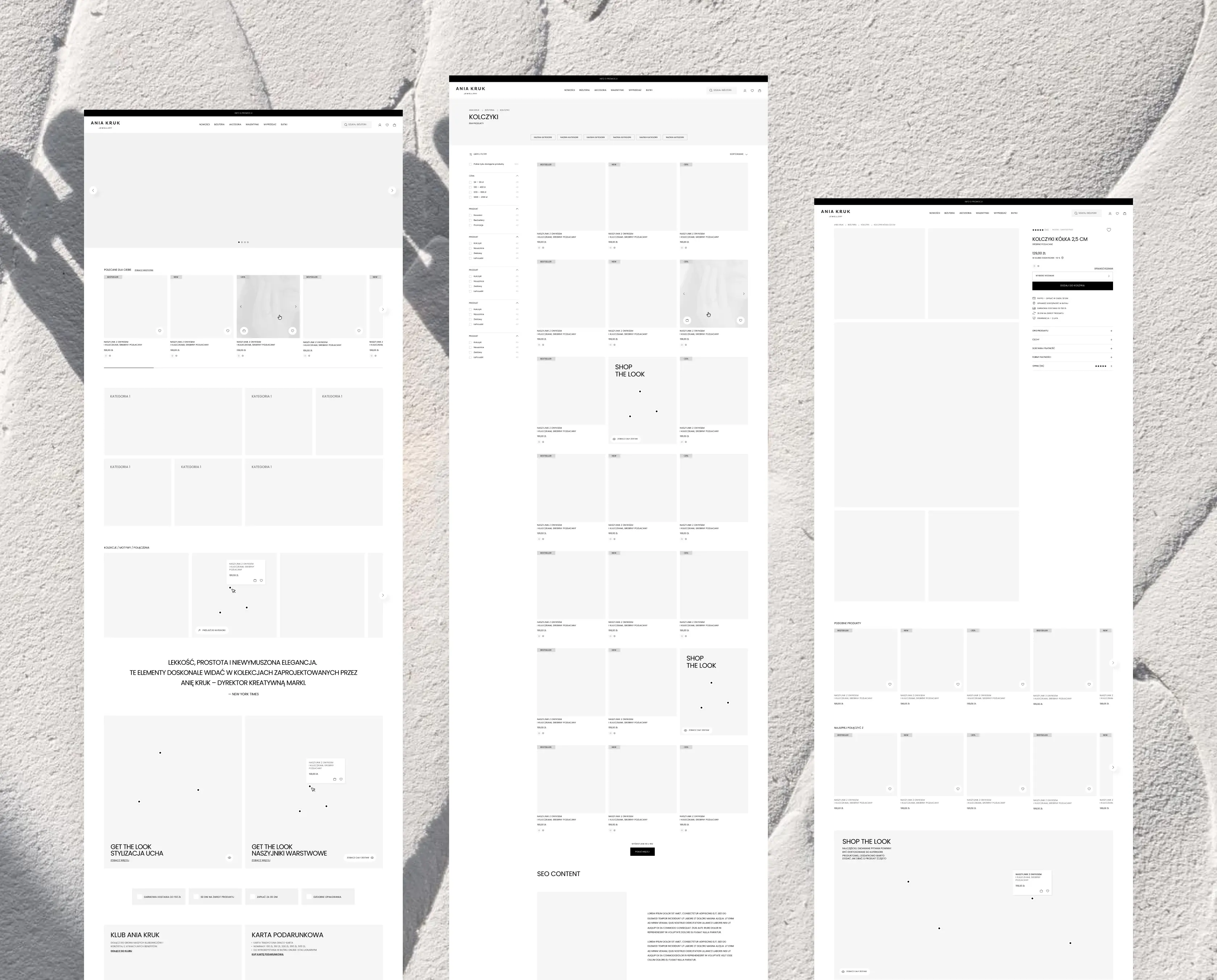
We began with low-fidelity wireframes, mapping the site structure, key content, and core functionalities. Then I created high-fidelity wireframes for the main views: homepage, product listing, product page, and search. After their approval, I designed the complete user interface for the entire site, presenting progress at weekly online consultations with the client.
High-fidelity wireframes let us discuss layout, key functionalities, and sales mechanisms in detail. Intentionally, they didn't include full branding yet. This kept the conversation focused on function and structure, avoiding the subjective opinions and strong emotions that early visual designs tend to trigger.
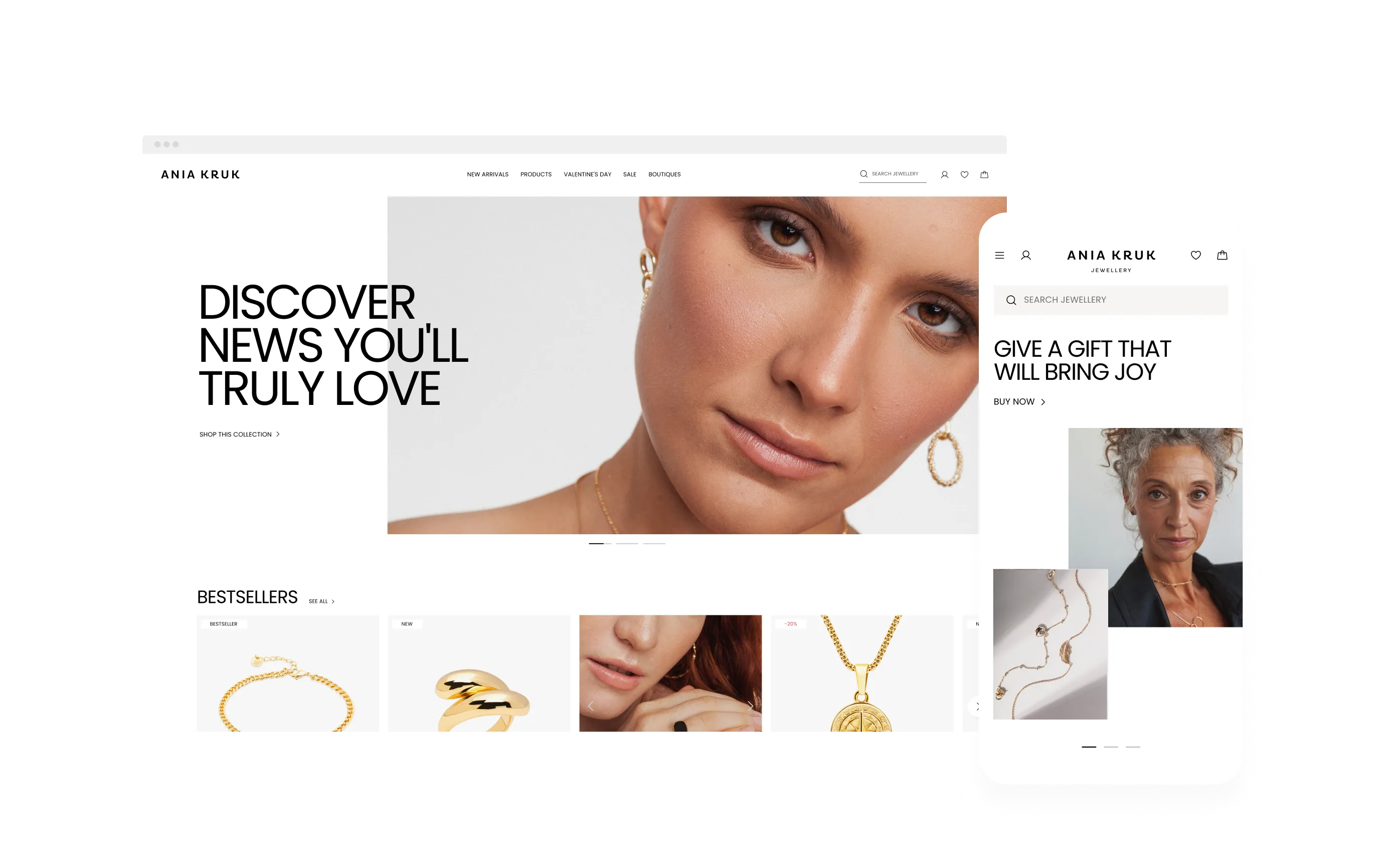
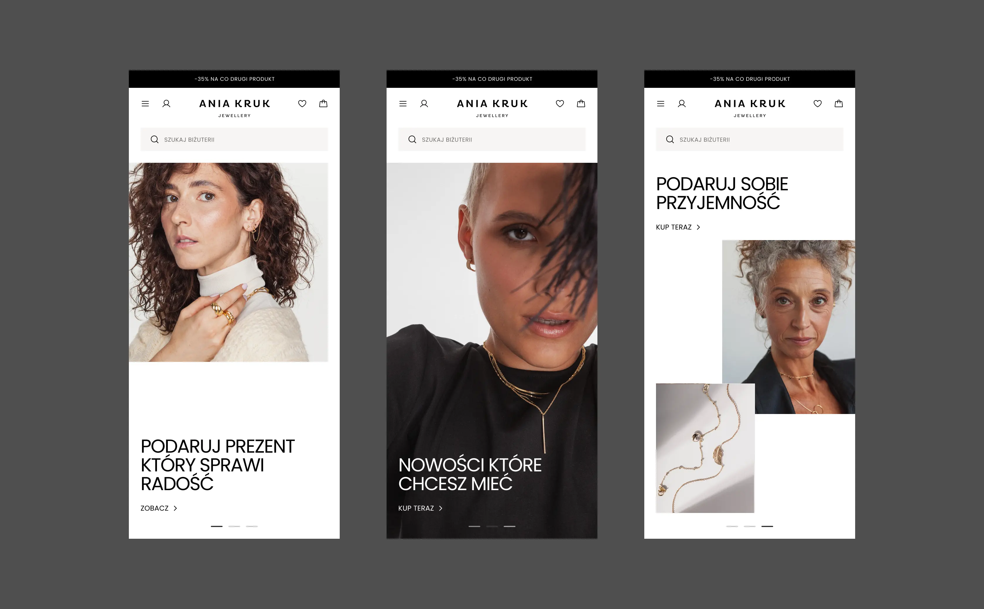
The homepage defined the visual style for the entire site. Working on this view, I established the foundations of the design system: typography, color palette, and grids.
I based its structure on a flexible modular system, designed so the client can build and modify layouts for current marketing needs on their own.
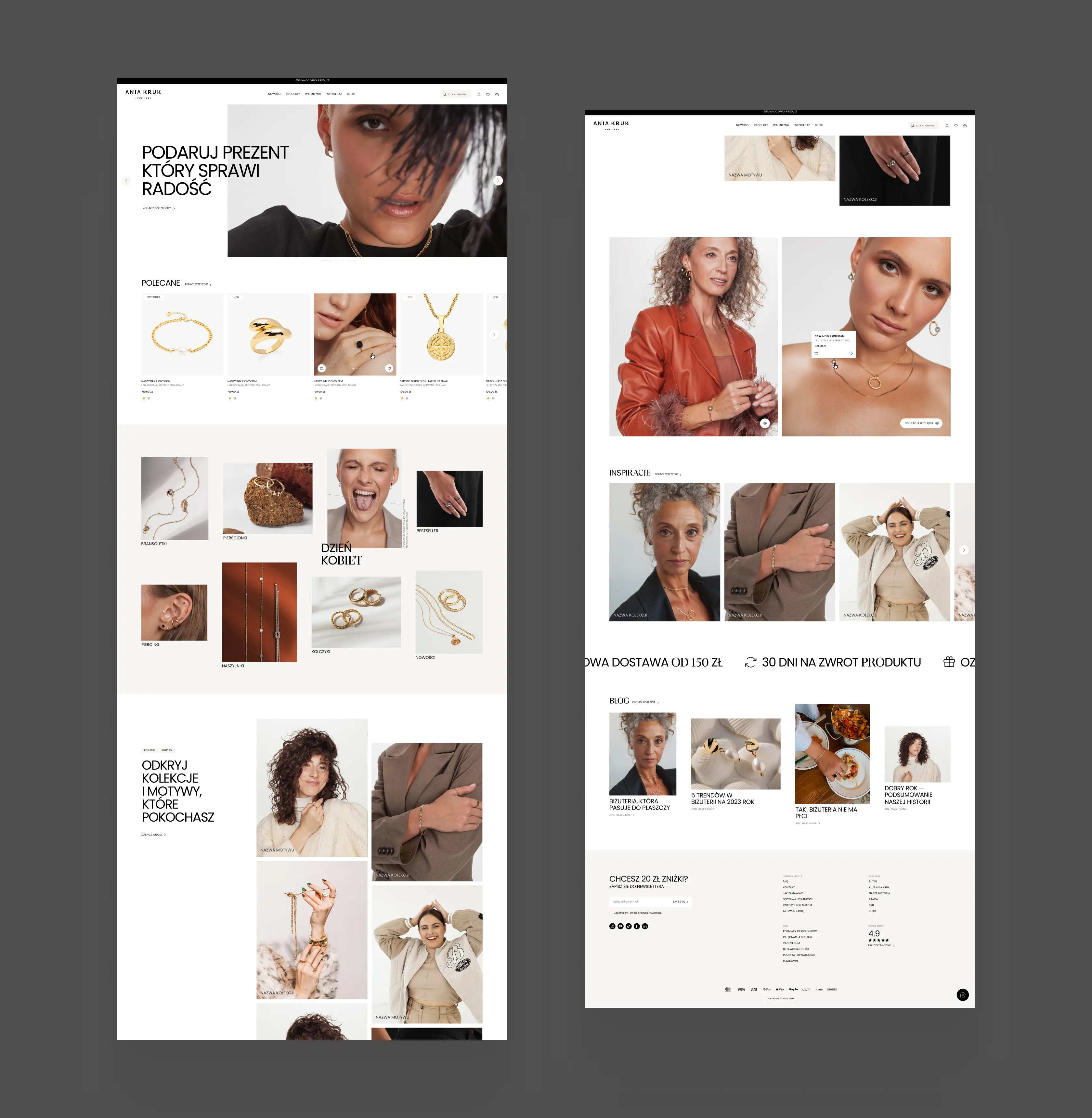
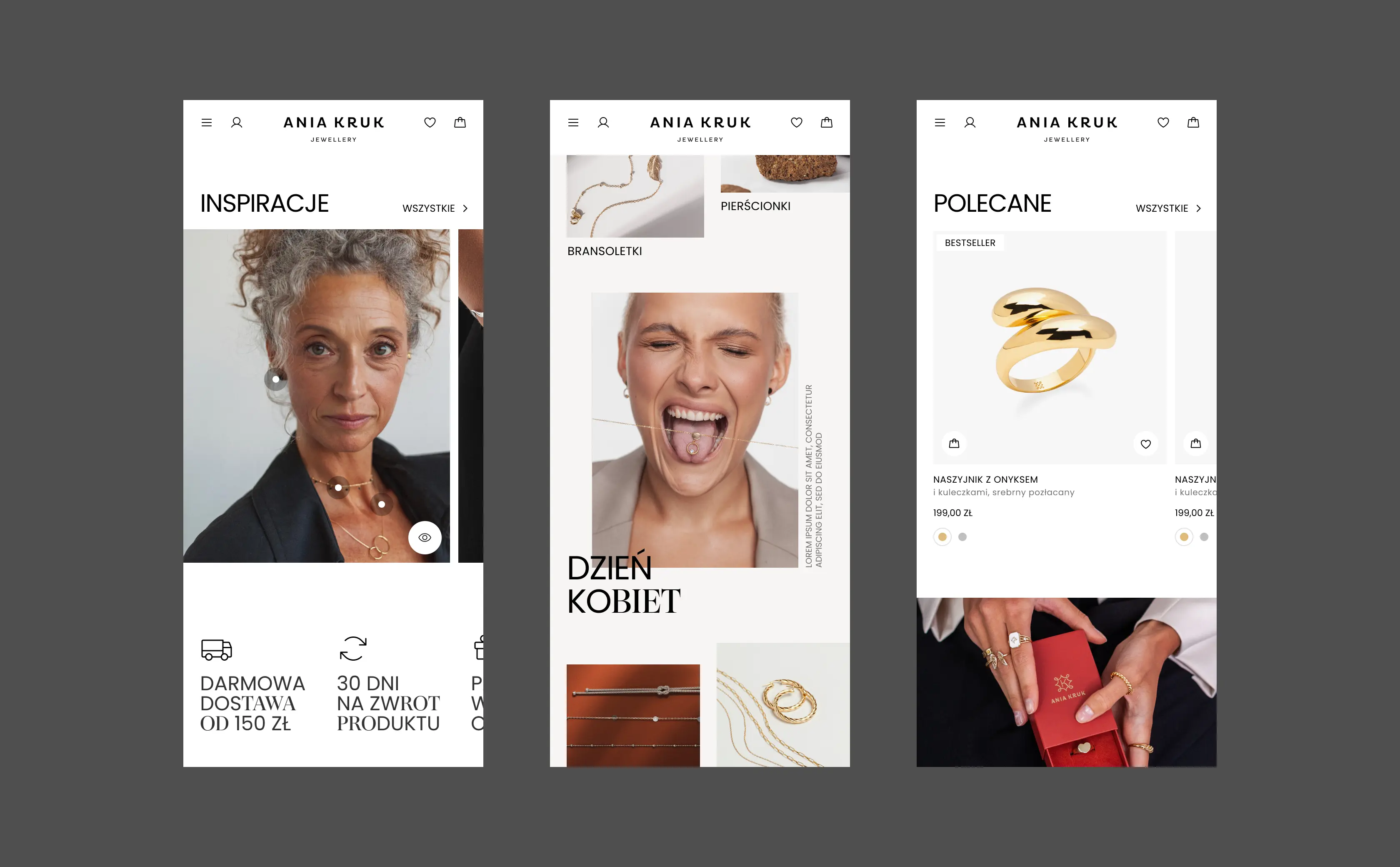
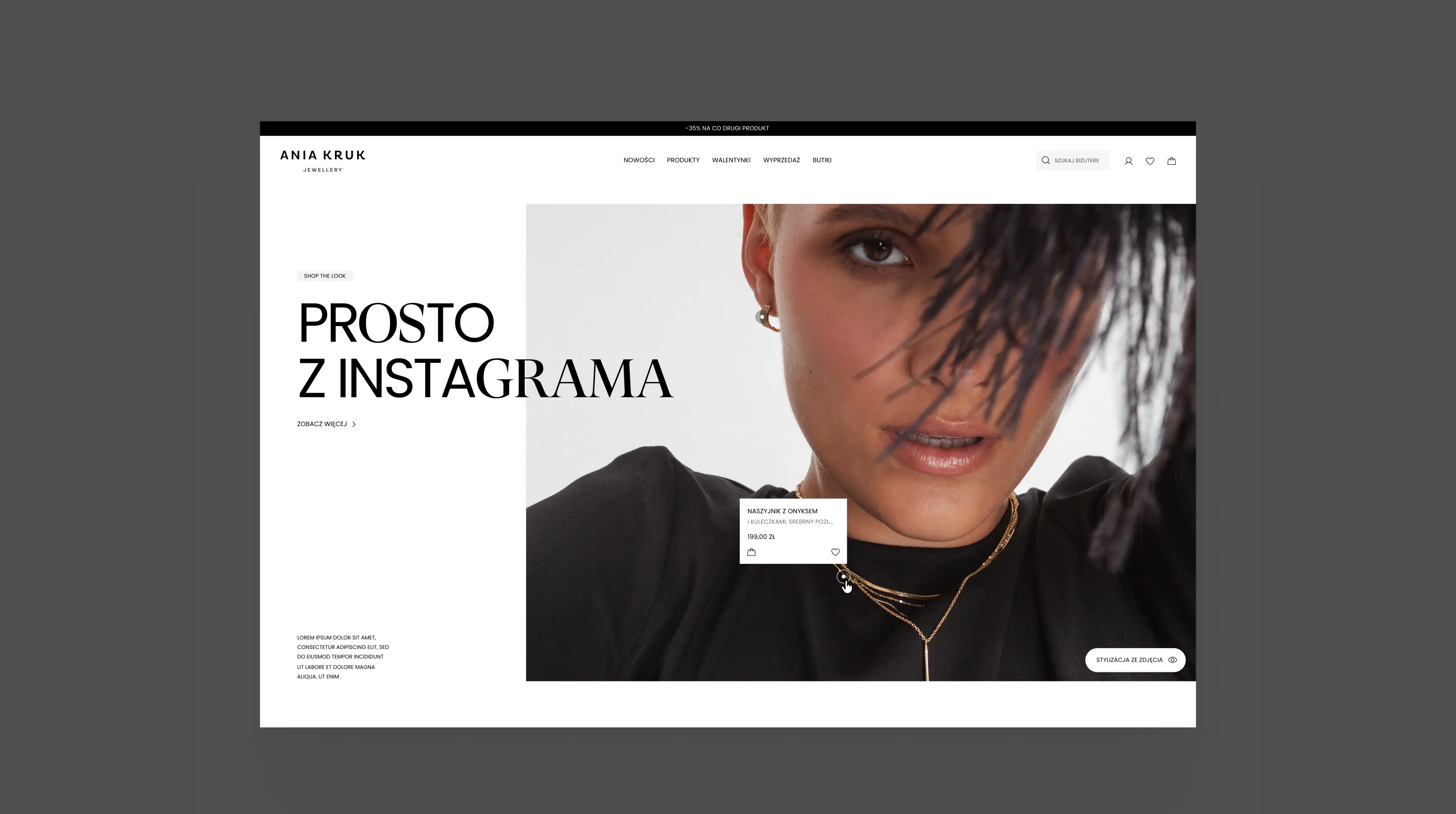
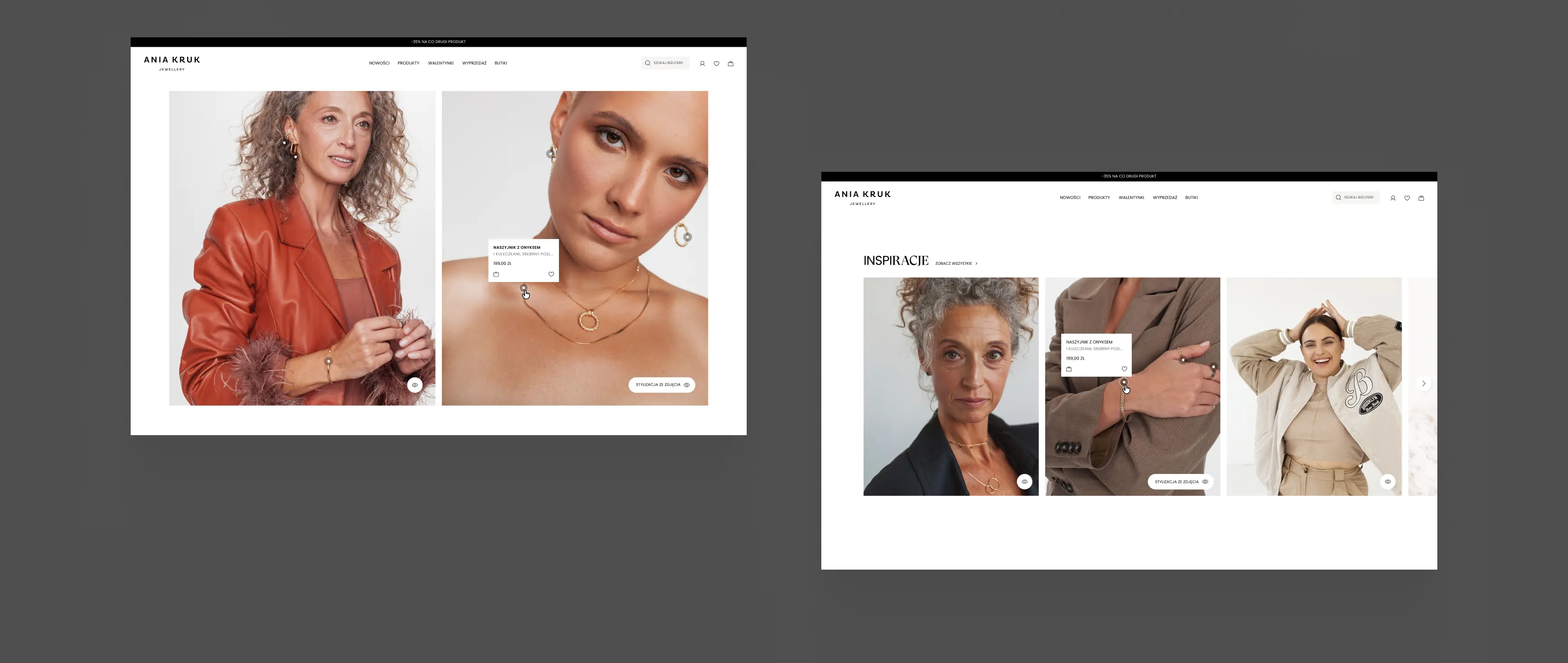
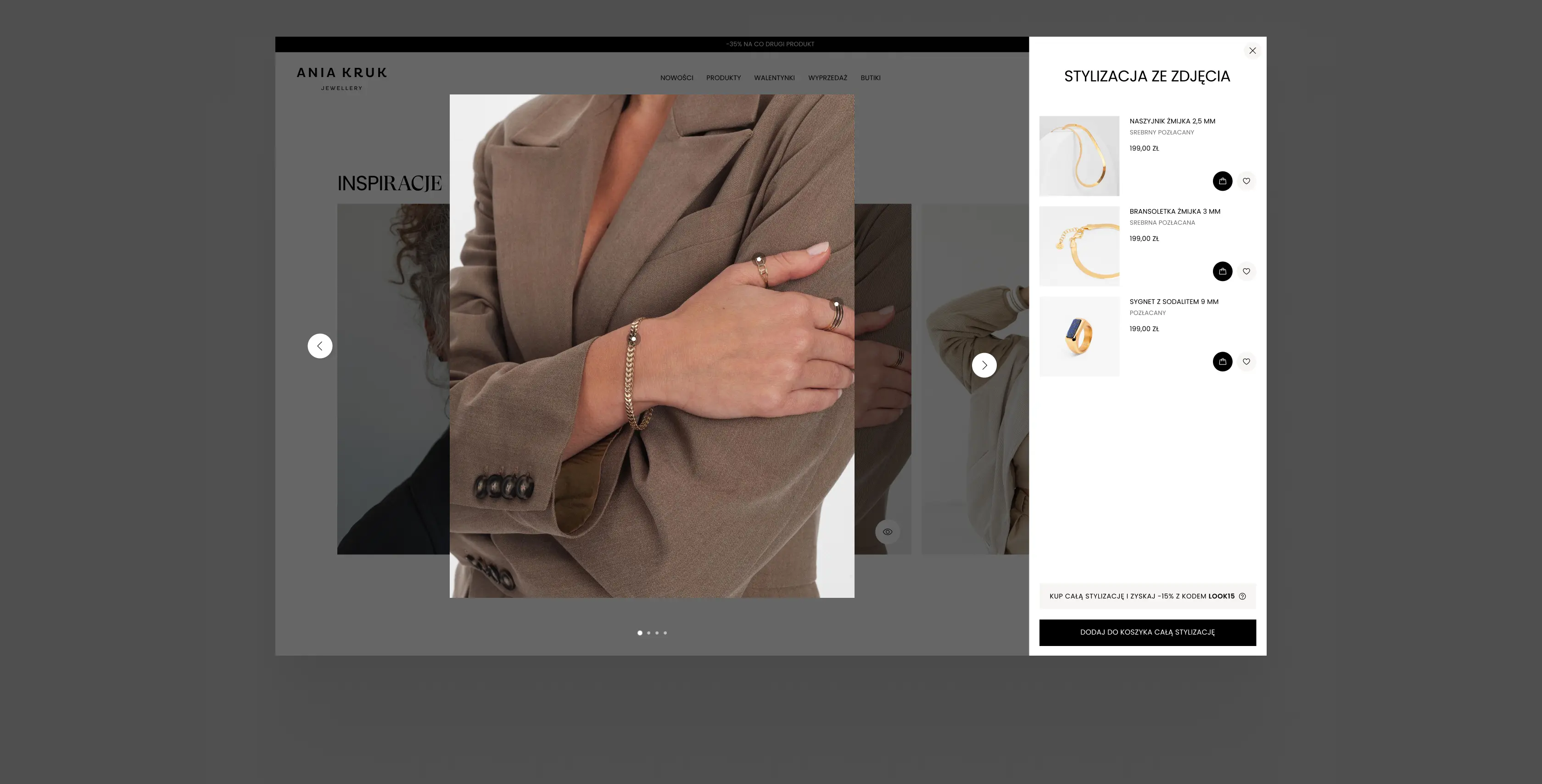
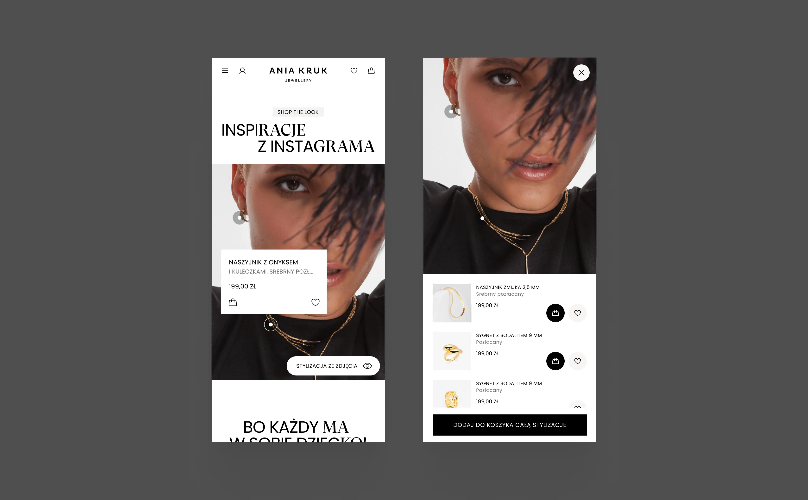
Clicking hotspots on a photo identifies the products and adds them to the cart. A dedicated "Add entire look to cart" CTA supports cross-selling. I designed the module in three versions, including a slider, so it fits different page contexts.
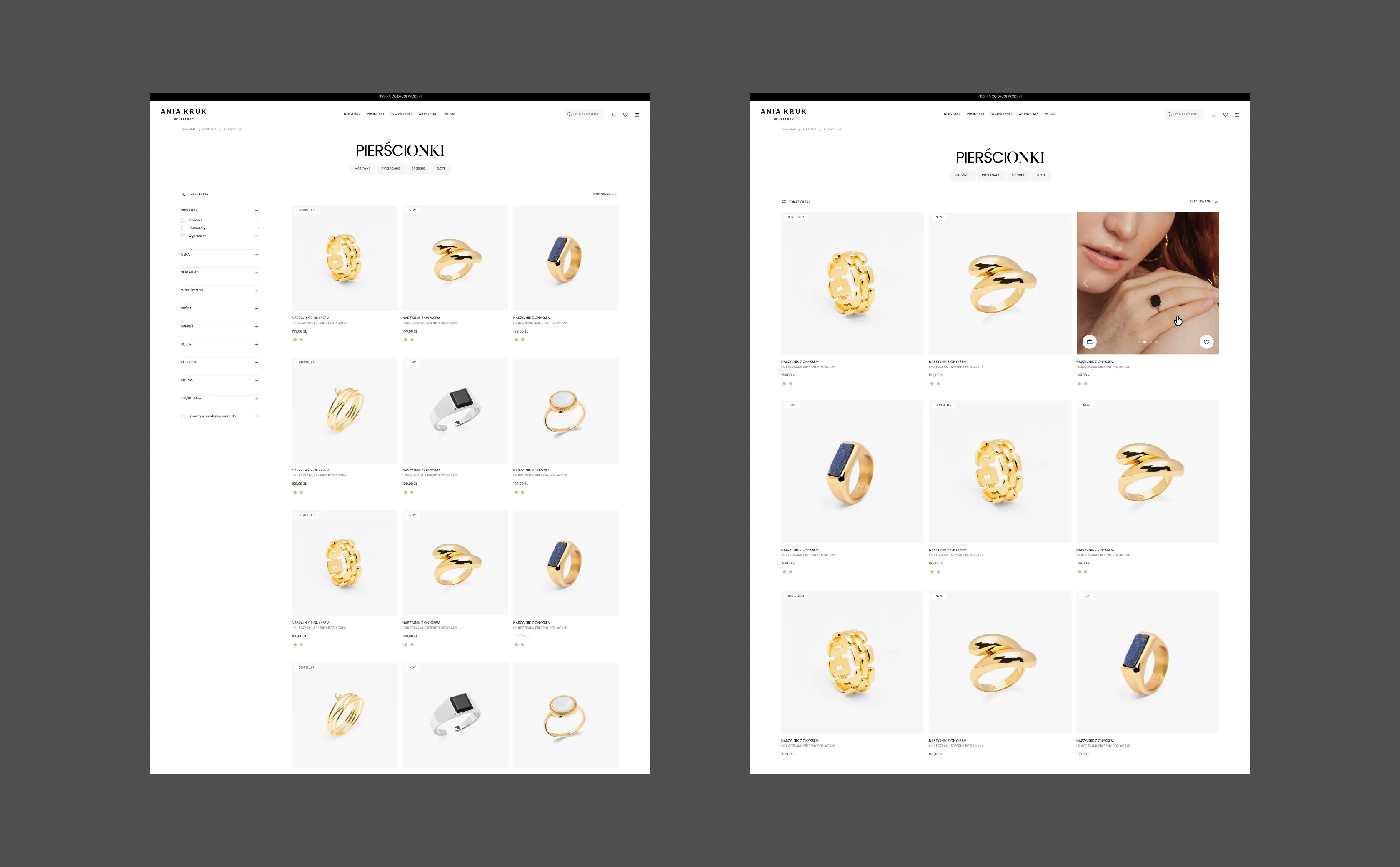
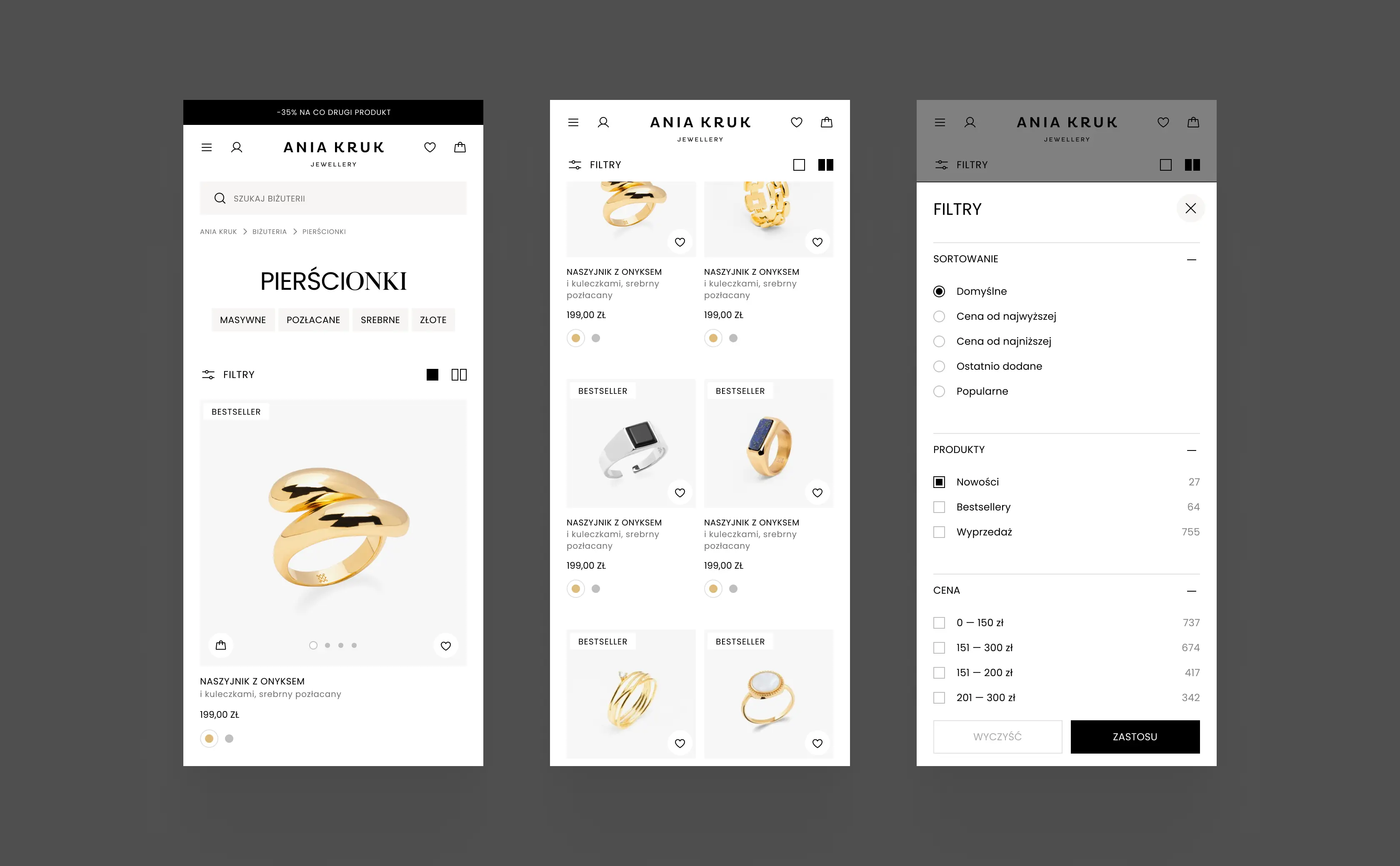
Category navigation and advanced filtering are the foundation of any product listing. My focus was mobile, the primary sales channel.
I designed a view switcher: a grid with two products per row for quick scanning, or a single-product view. The single view lets users browse additional photos and add items to the cart or wishlist directly from the list, without opening the product page. Fewer steps, faster decisions.
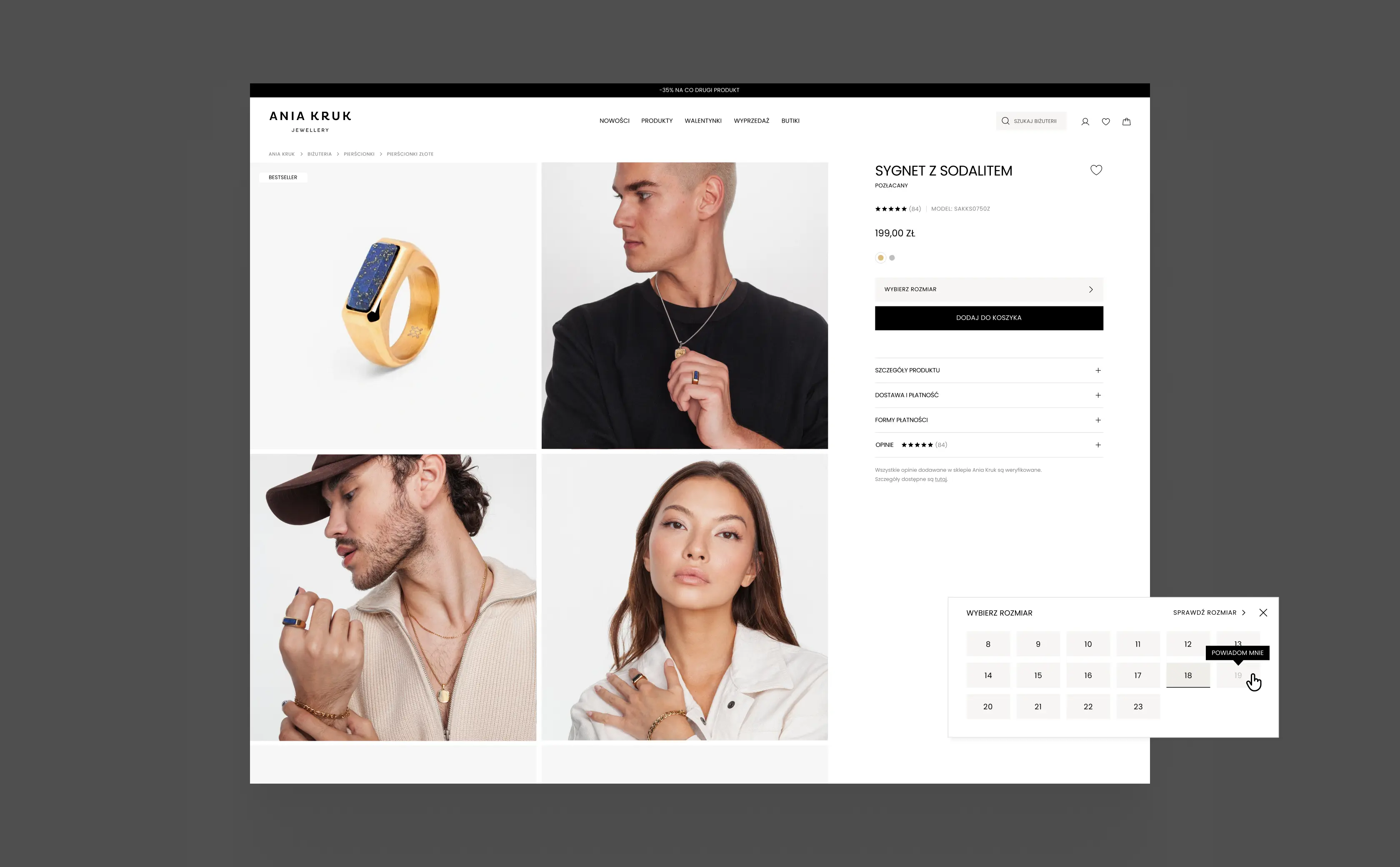
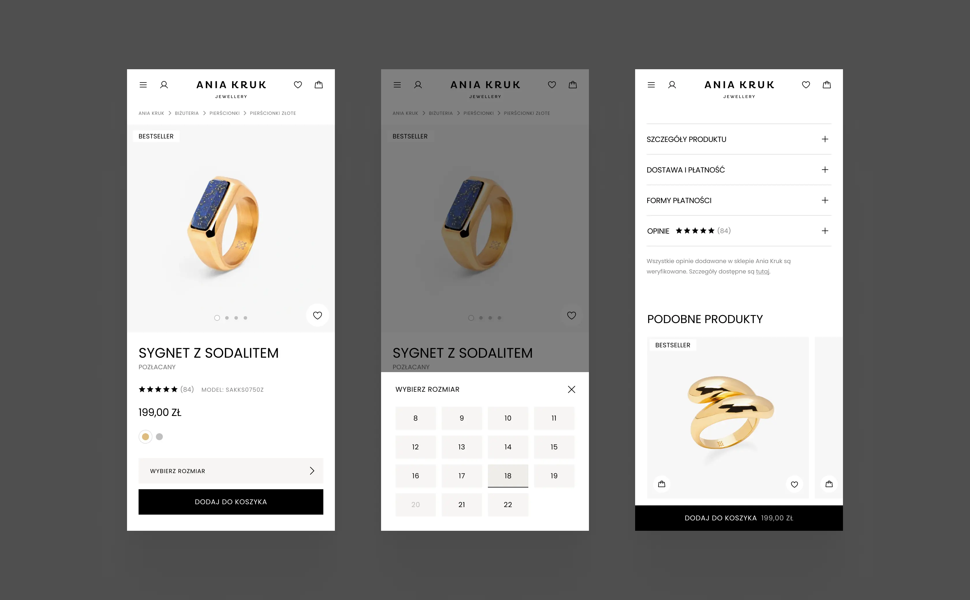
The product page looks simple but carries a lot: size selection with a guide, back-in-stock alerts, an in-store product locator with a map, club member pricing, and current promotions.
All crucial information sits on a single page. Expandable accordions and slide-out drawers keep the layout clean and the user in the product context.
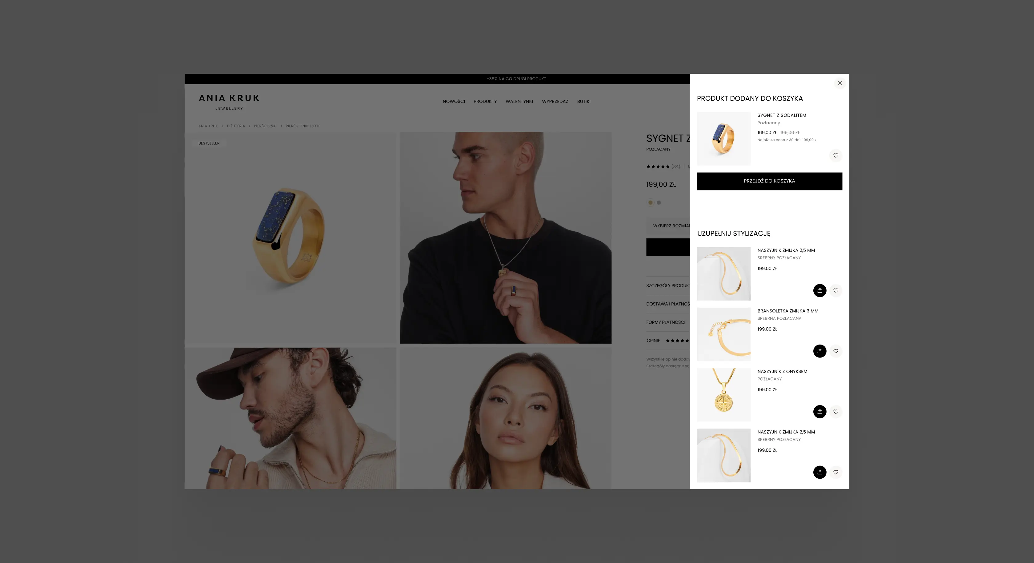
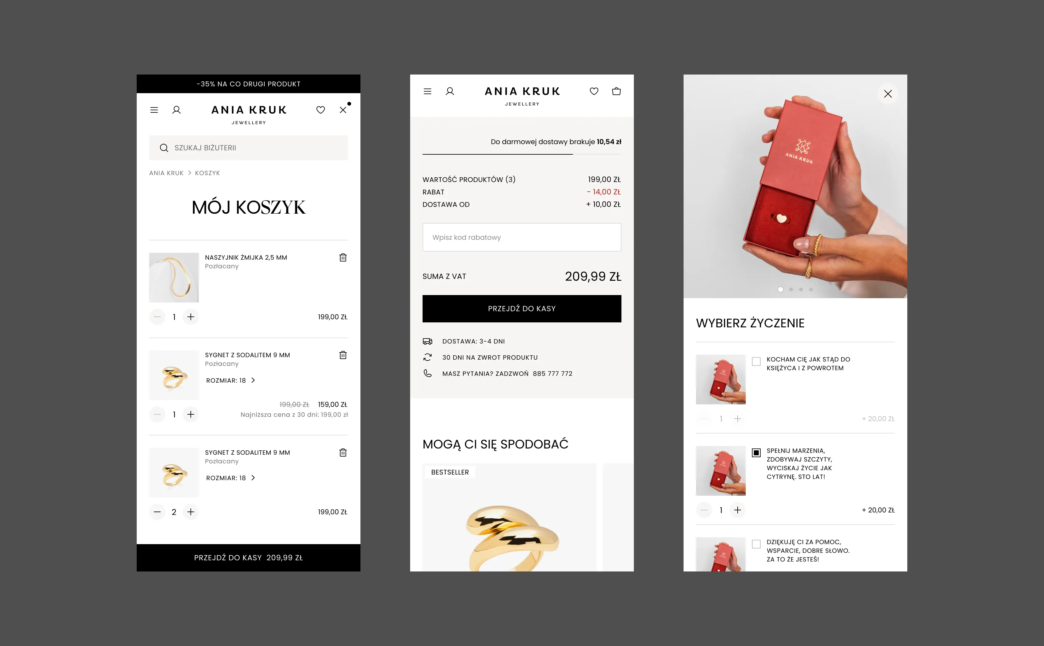
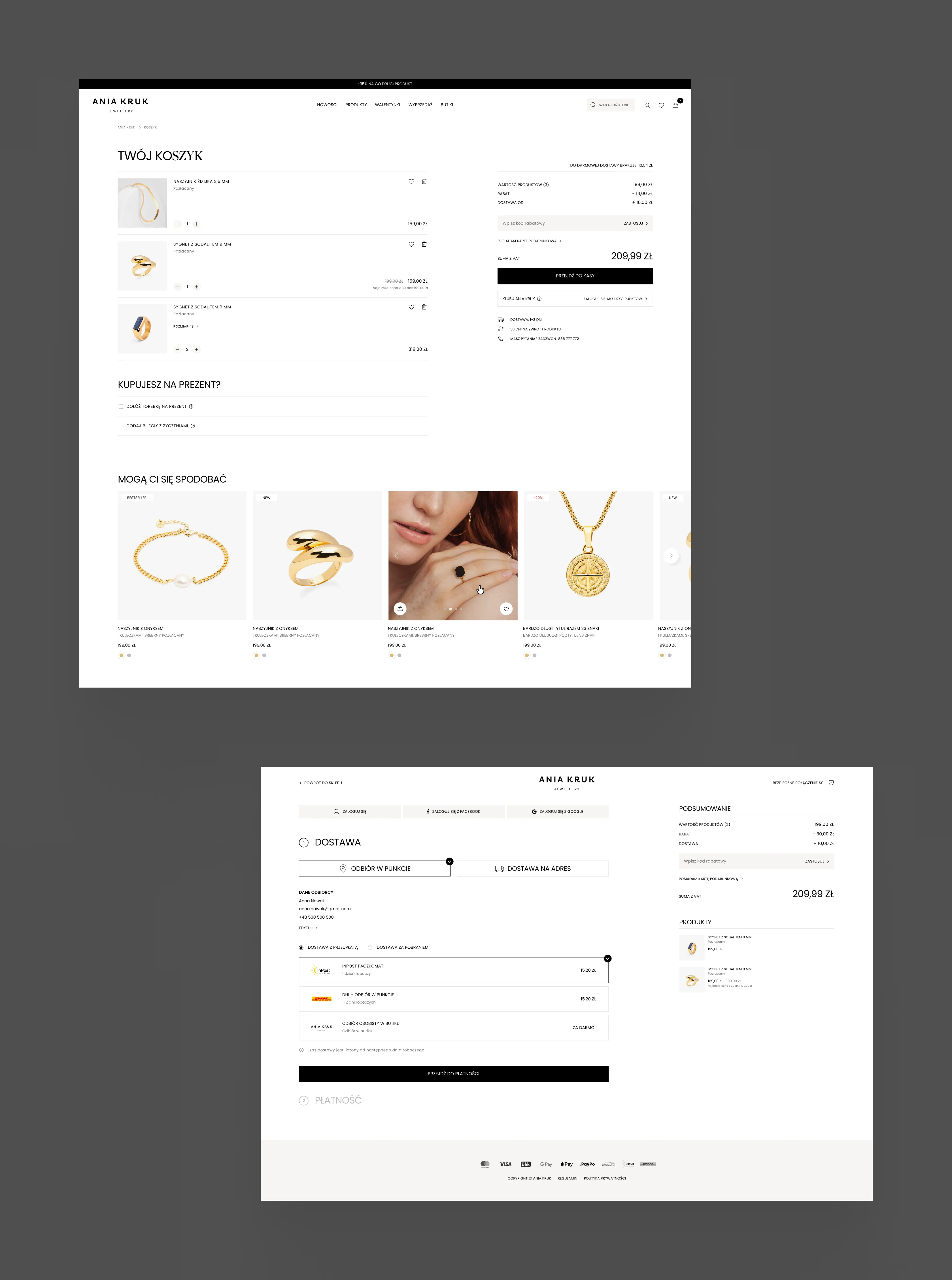
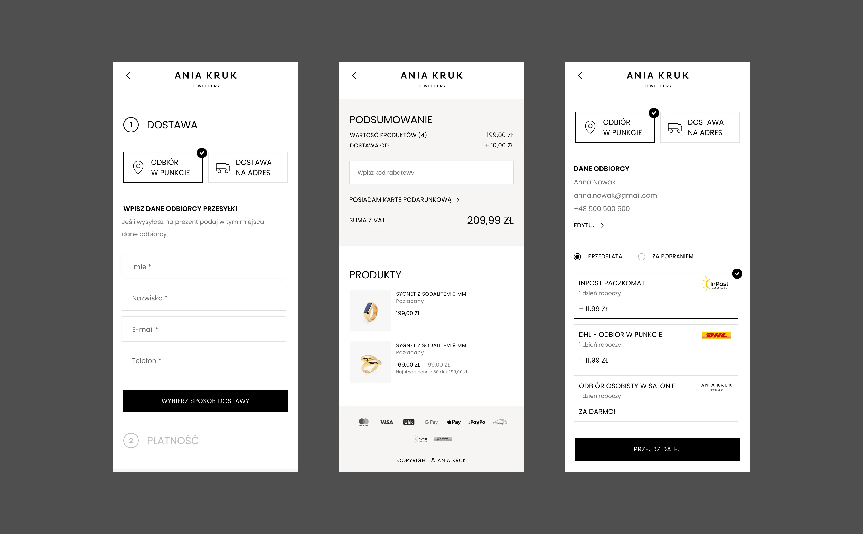
I redesigned the checkout from scratch. This is the part of the store where UX work translates most directly into conversion.
I also designed extended gifting features: shipping to a different address with an e-receipt for the buyer, hiding the price on the gift tag, and a personalized note. Other improvements include editing product sizes directly in the cart, prompts for account creation and club membership, and simple handling of discount codes and gift cards.
Returning customers get saved addresses, preferred delivery methods, and payment details, with easy data management in the account panel. Every next purchase is faster.
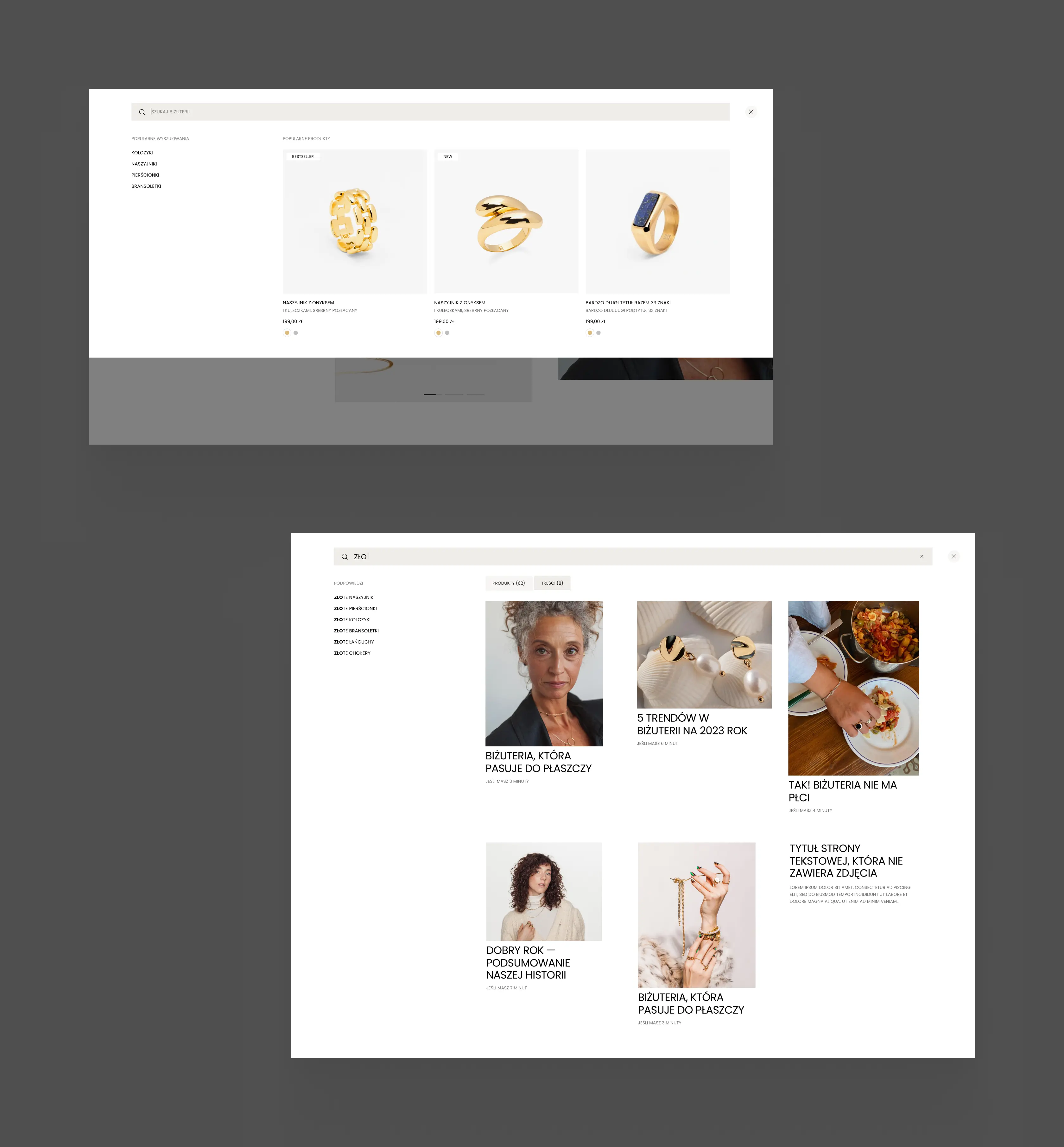
The search got a full redesign: popular products, popular searches, intuitive suggestions, and results divided by content type.
Landing pages need flexibility, so I extended the modular approach with a dedicated set of additional modules built specifically for them.
Combined with the homepage modules, this gives the client a system to build any type of landing page (sales, brand, informational) by assembling modules, without developer involvement.
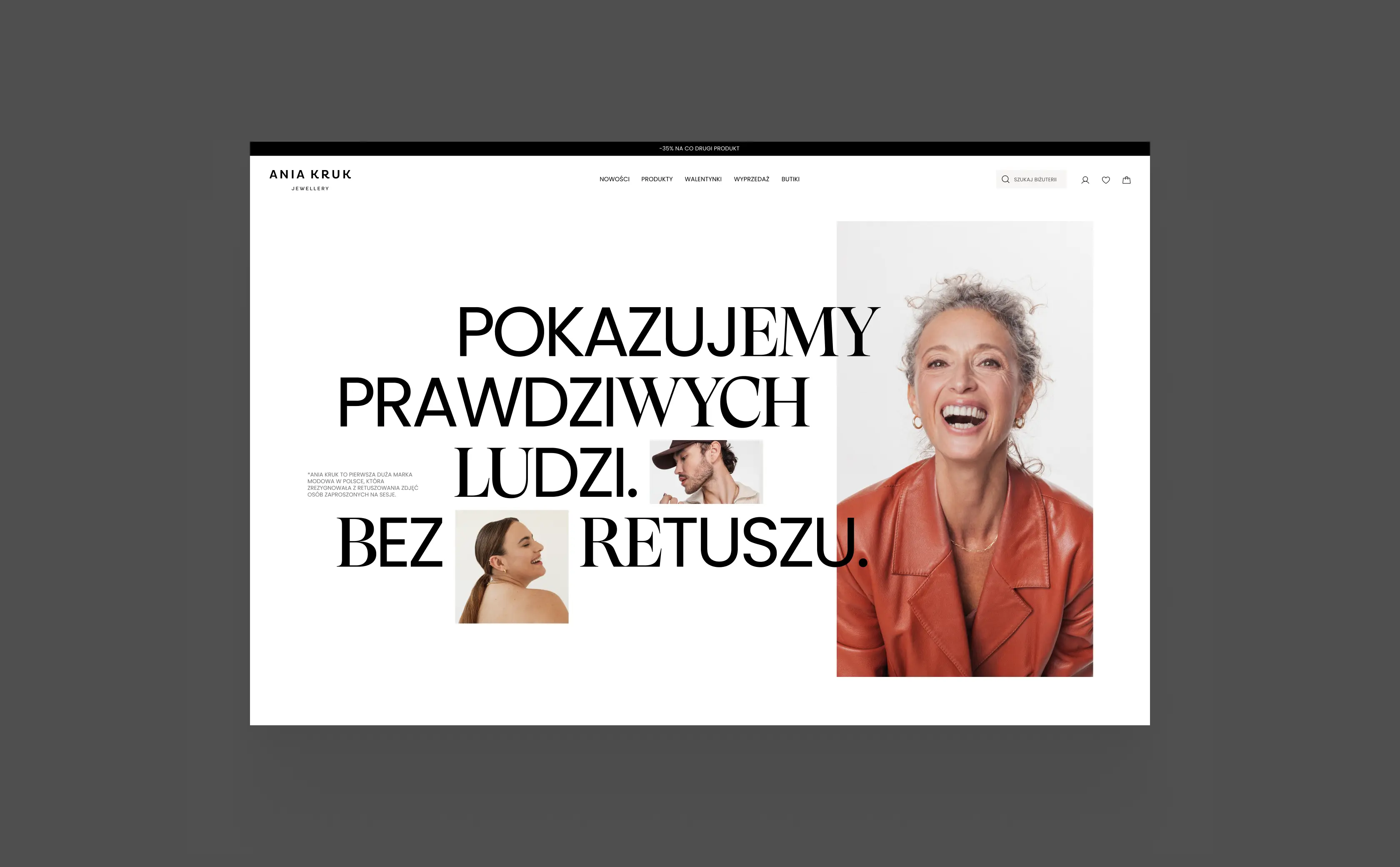
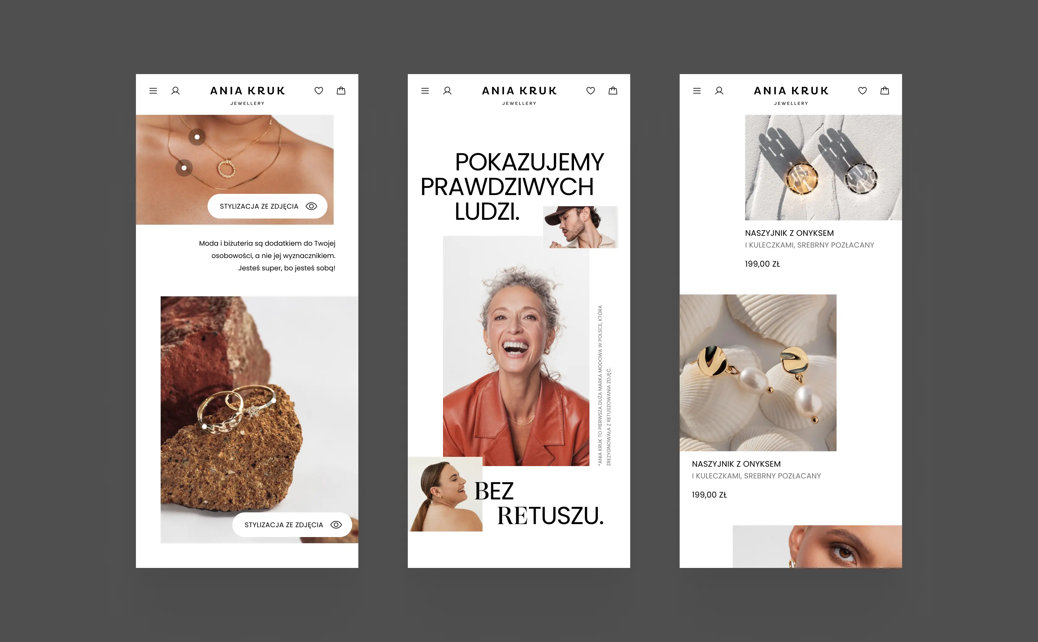
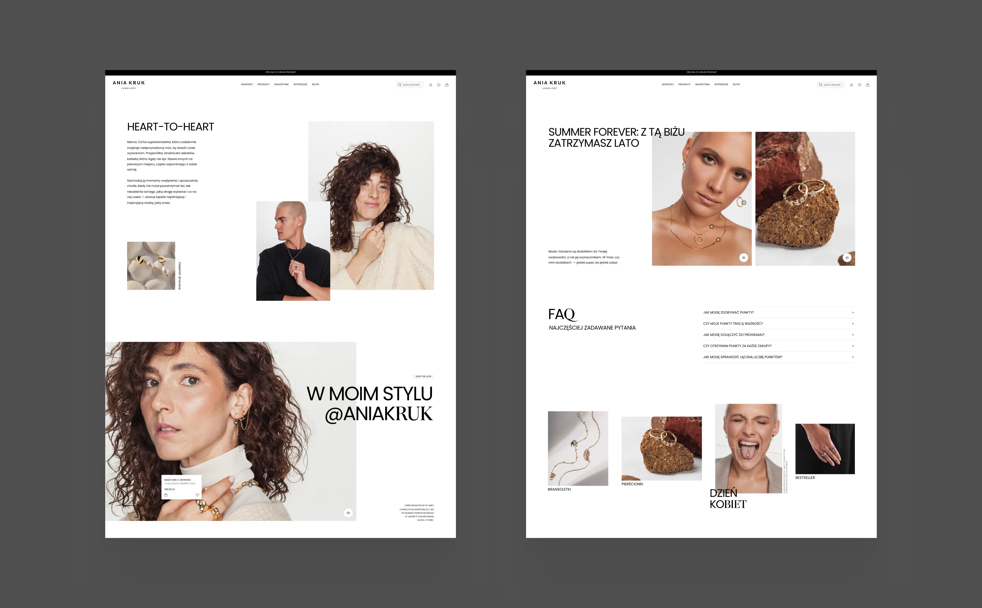
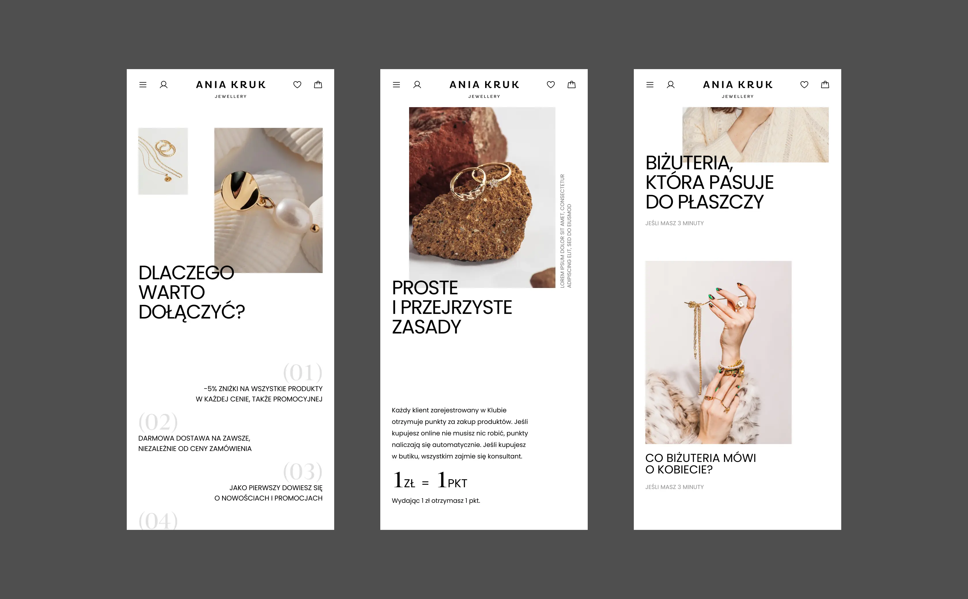
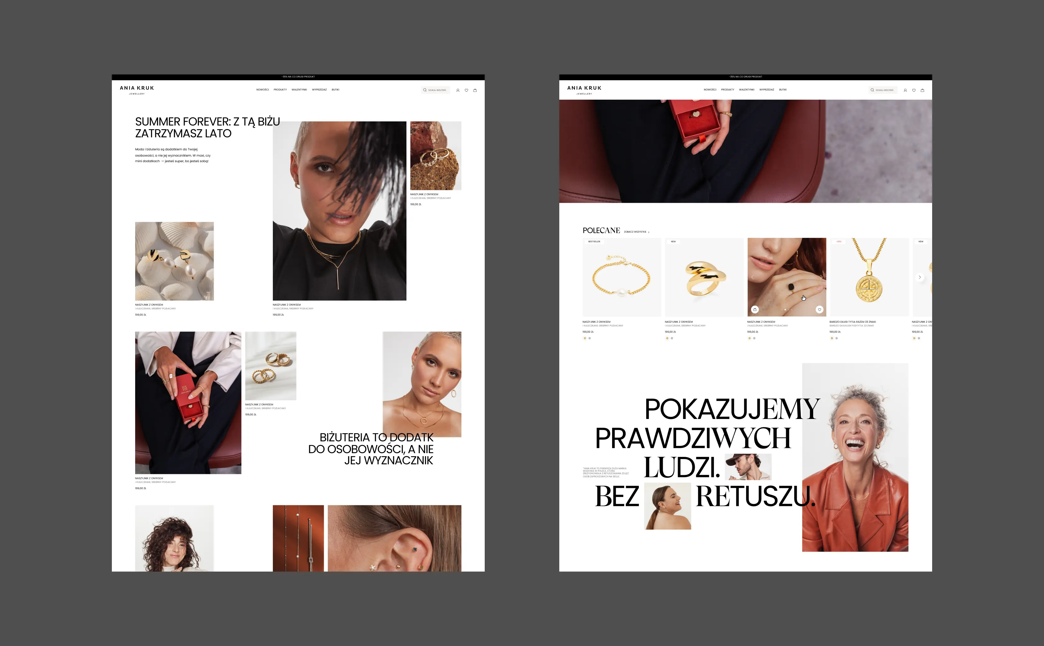
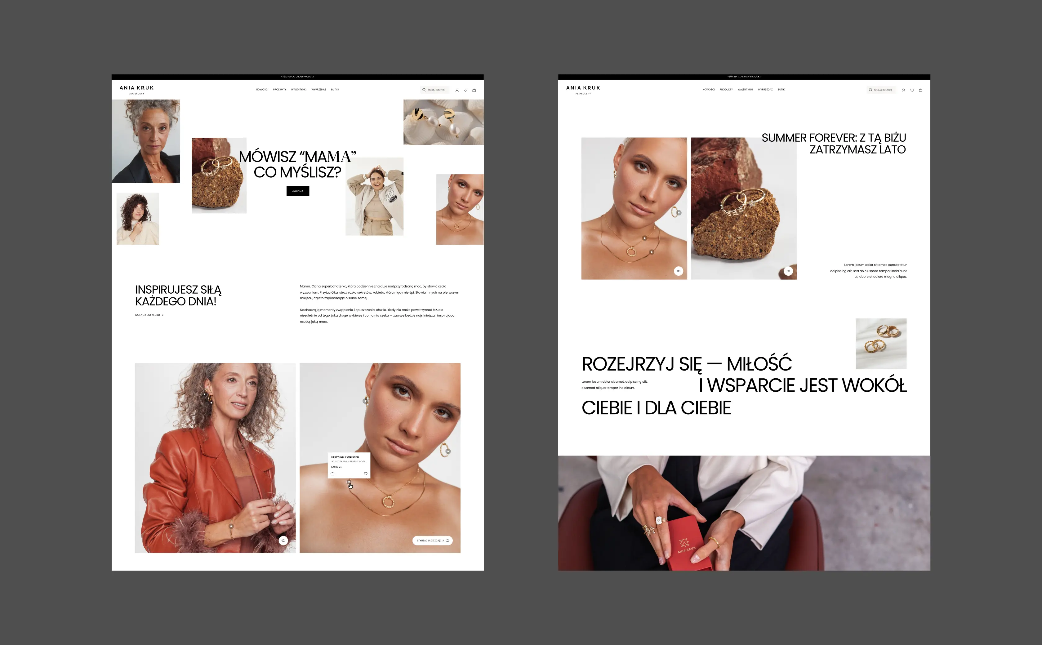
My work ended with a complete design handoff: hundreds of screens covering the entire store, a design system, and a modular library for building landing pages without a developer.
Ania Kruk was designed the classic way: wireframes, Figma, handoff. Today I work differently, designing directly in code with AI. Same craft, but the deliverable is a working, clickable prototype instead of static mockups.